Brand Architecture
Overview
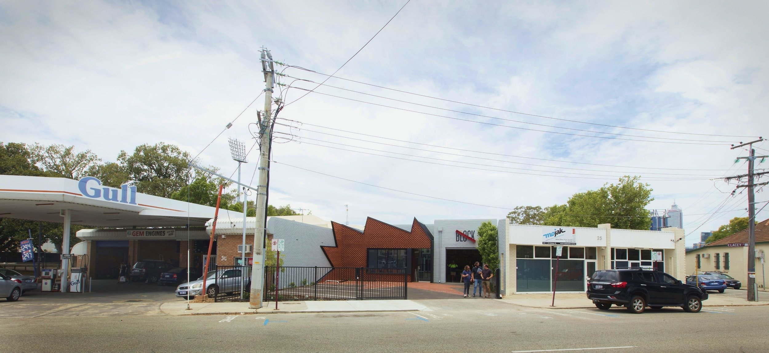
In 2016, Block Branding relocated their business into a converted mechanics workshop in North Perth. The move prompted an update of their company’s own brand and identity and a modest one-room extension to this building created an opportunity for Bosske to present this brand to the street. Taking our cues from the service station next door, it became a unique advertising opportunity, where architecture and signage conflate.
“Unlike the traditional ‘fitout = identity’, Block’s identity spills into the streetscape”
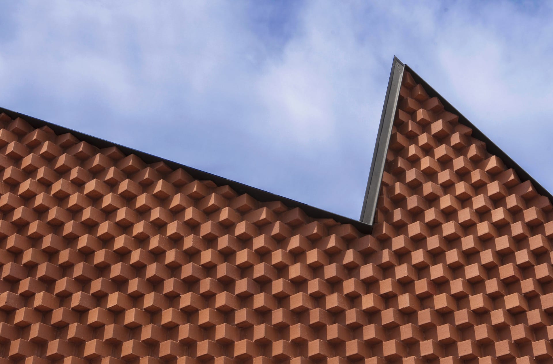
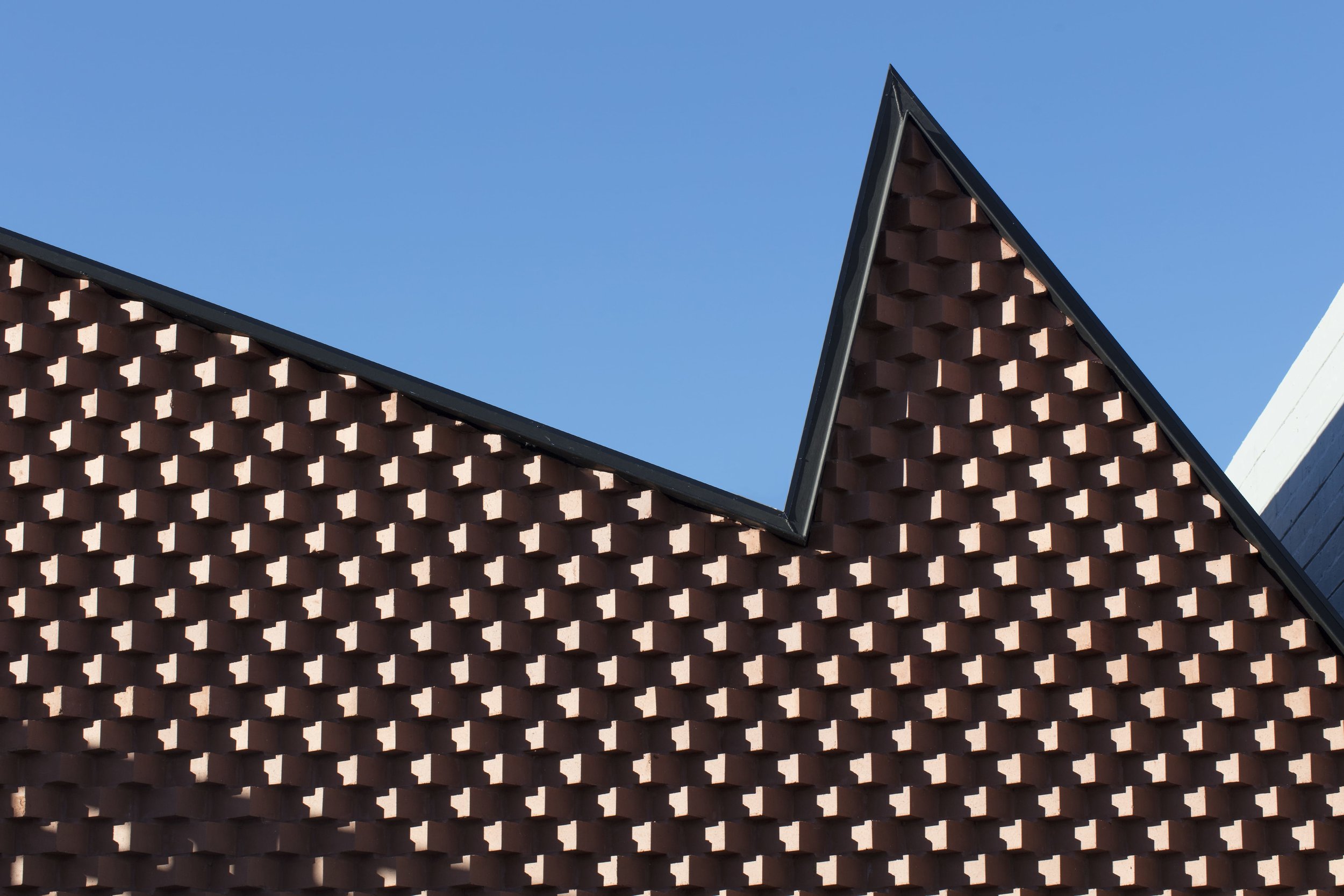
The building’s original life as Christ Cream Motors workshop created a large setback from the street for carparking and results in an unfortunate street address for a new commercial business. Our design concept was to link the building with the street using an iconic starburst figure, a form that has become synonymous with advertising, art and pop culture. The shape is applied to the building and carpark using a process of perspectival projection where the result creates multiple architectural opportunities; an industrial saw-tooth room, a trellis wall, a courtyard, and a new pathway to the entry, connecting the building to the street.


“I love the sheer audacity and the total whimsy”

Services
Lead Consultant, Brief Development, Concept Design, Schematic Design, Design Development, Documentation & Contract Administration
Details
Hit a brick wall?
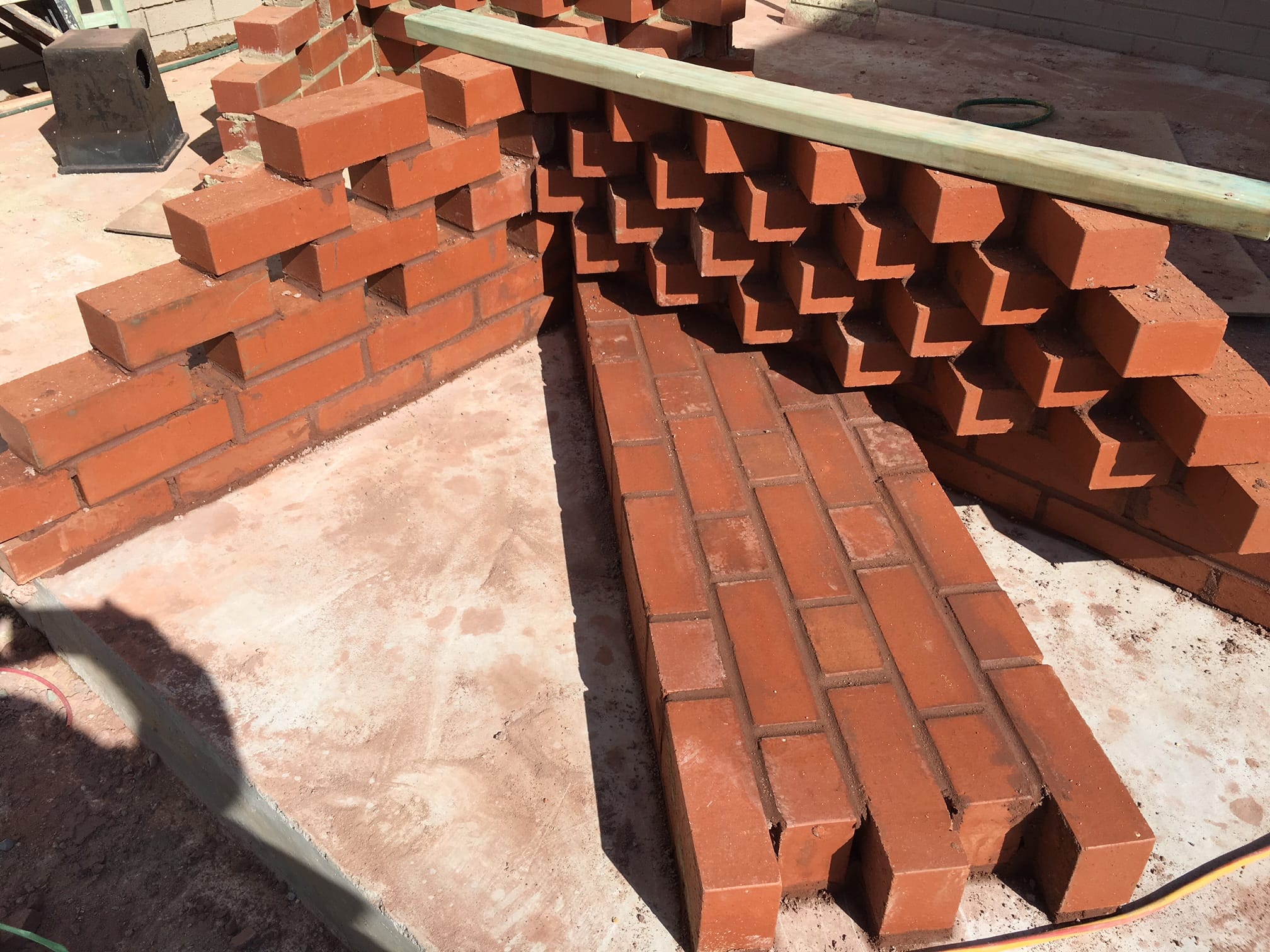
Brick construction is synonymous with Perth and a quick tour around the neighbourhood made it an easy material choice. Fitting this dynamic shape with bricks however meant getting bricks to do things they don’t normally do. Cut at odd angles or cantilevering upwards and outwards – the shape reduces the brick to an infill pattern, perhaps like the screen print of a Lichtenstein artwork. Four styles of brickwork fill the projecting forms to achieve mass, colour and texture with moments of unexpected weightlessness.
From warehouse to office
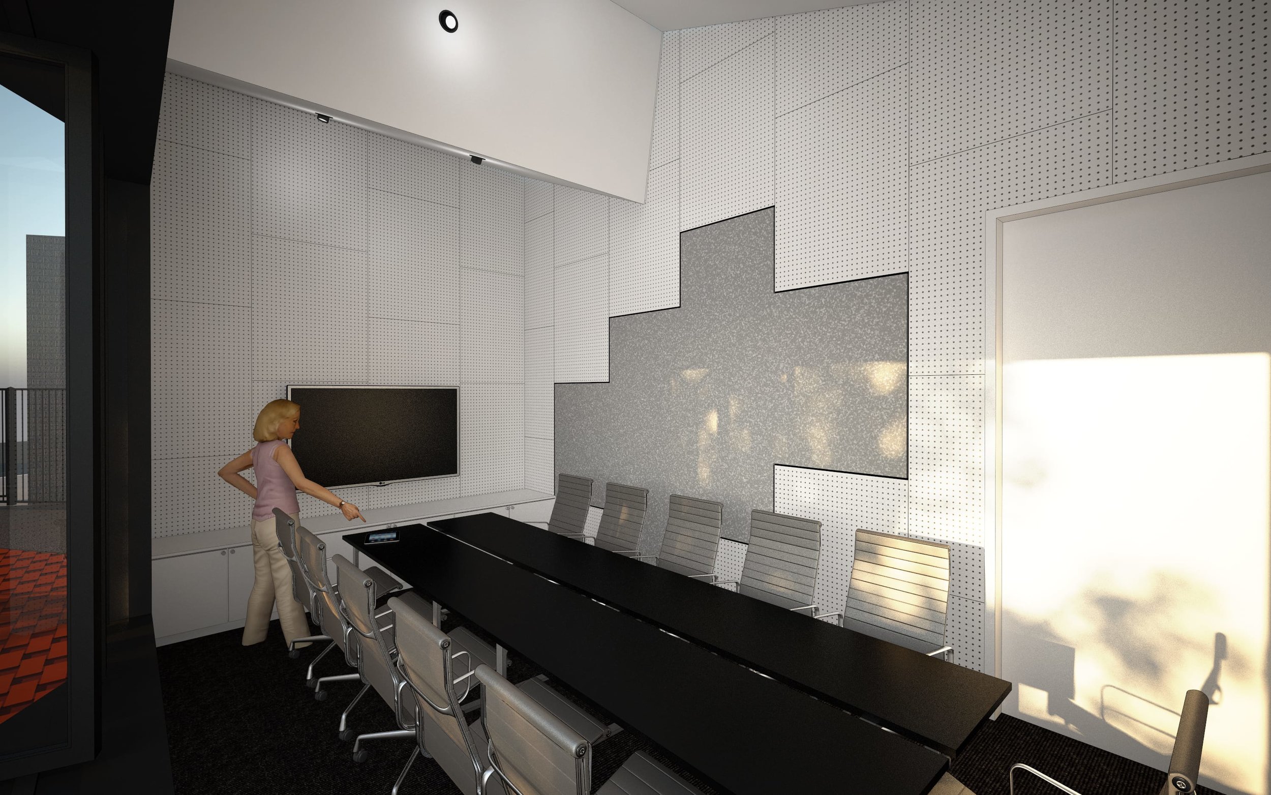
Inside, the office planning is divided into three zones – the welcoming front of house; the meeting areas and amenities; and working areas and storage to the back. Block previously inhabited a 350sqm office space, but careful planning of the headquarters has increased the number of workstations and overall amenity in a total floor area of just 200sqm. It’s a new working model for the business and the transparency and variety of social areas, including the waiting lounge, tea room and boardroom mean that most are multipurpose – doing more with less.
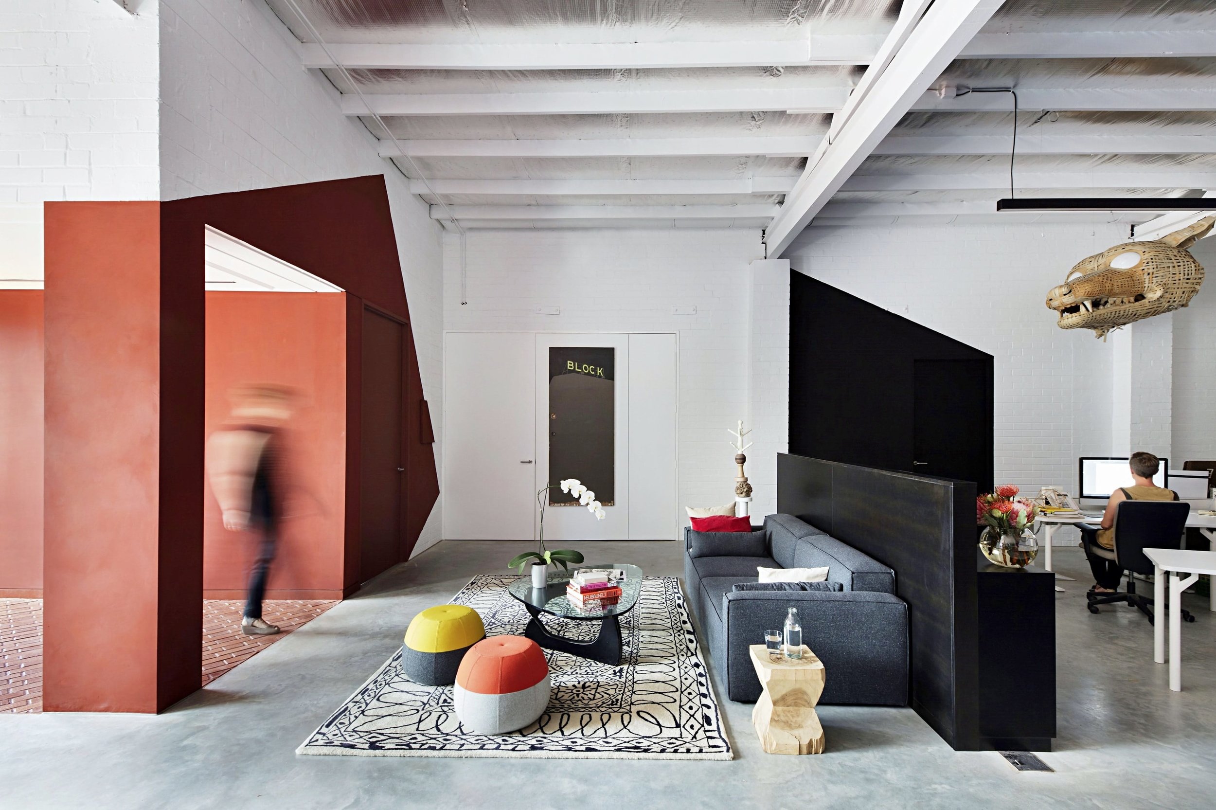
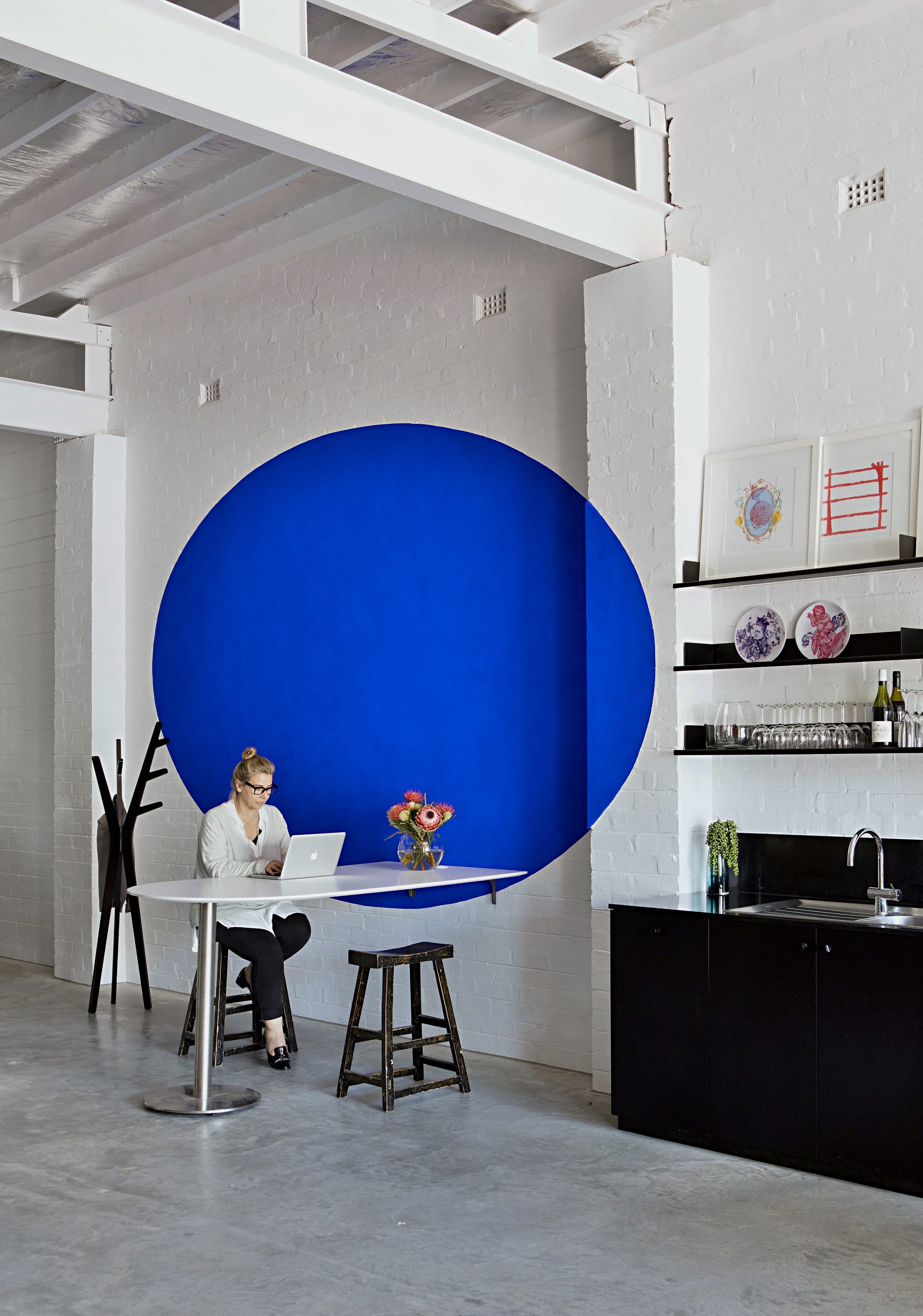
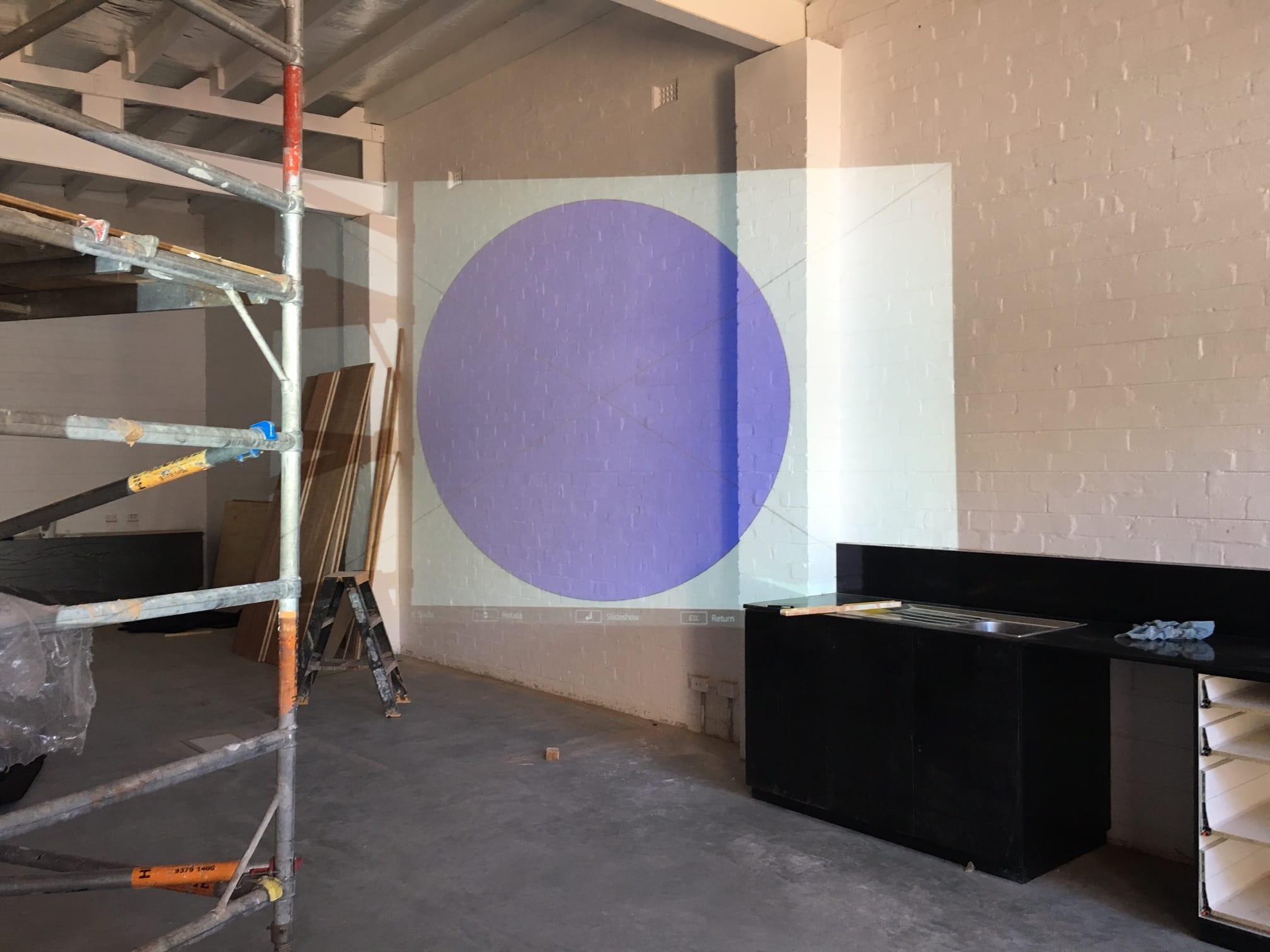
More than just one big room
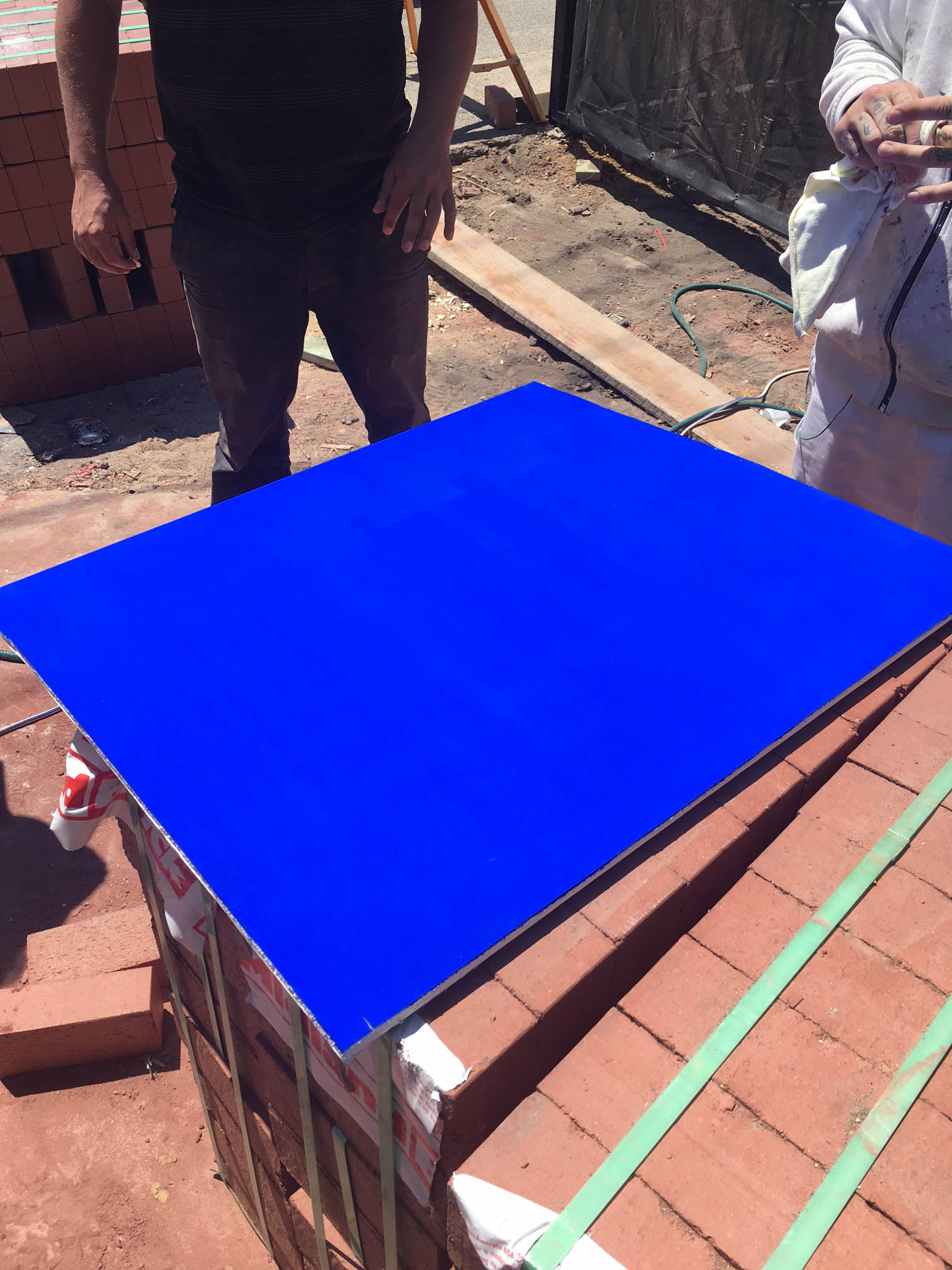
The exterior branding theme continues inside the office space, with projected shapes of colour located to demarcate the zones: entry is red, amenities in black, while a yellow slash to the library and the blue dot because why not? They are all visual way finders for staff and visitors within. All the new fittings and furniture are dressed in black, apparently floating over the projected shapes. An entirely new boardroom is located within the sawtooth starburst. Lined in pegboard, it is both a versatile display area as well as a link to the property’s former life as a mechanic’s workshop.