Suburban Relic
Overview
The suburb’s vernacular is typified by an eclectic mix of federation houses, some remodelled in what is locally known as the ‘European style’ - the result of a largely migrant population modernising older housing stock to meet their requirements. This also brought a form of suburban agriculture to Mt Lawley: vegetable gardens, lean-to’s, drying sheds, incinerators, pizza ovens etc. creating another world of industry and infrastructure to the rear of these blocks and invisible from the street.
Remodelling of federation houses became so commonplace in the area, the local Council considered applying a heritage listing to the altered housing stock. While this didn’t eventuate, it presented an interesting idea of the historic and cultural value of these houses that we were compelled to respond to. The Camino House is the outcome of a ‘renovated-renovation’. It preserves the buildings chequered history, embraces its eclectic style and perhaps even amplifies it.
“This project has wow factor… there was an enormous sense of ‘wow what is this spaceship that has landed in this suburb of Western Australia?’ There was extraordinary excitement.”
Services
Lead consultant, feasibility, master planning, brief development, concept design, schematic design development and documentation
Details
Chimney
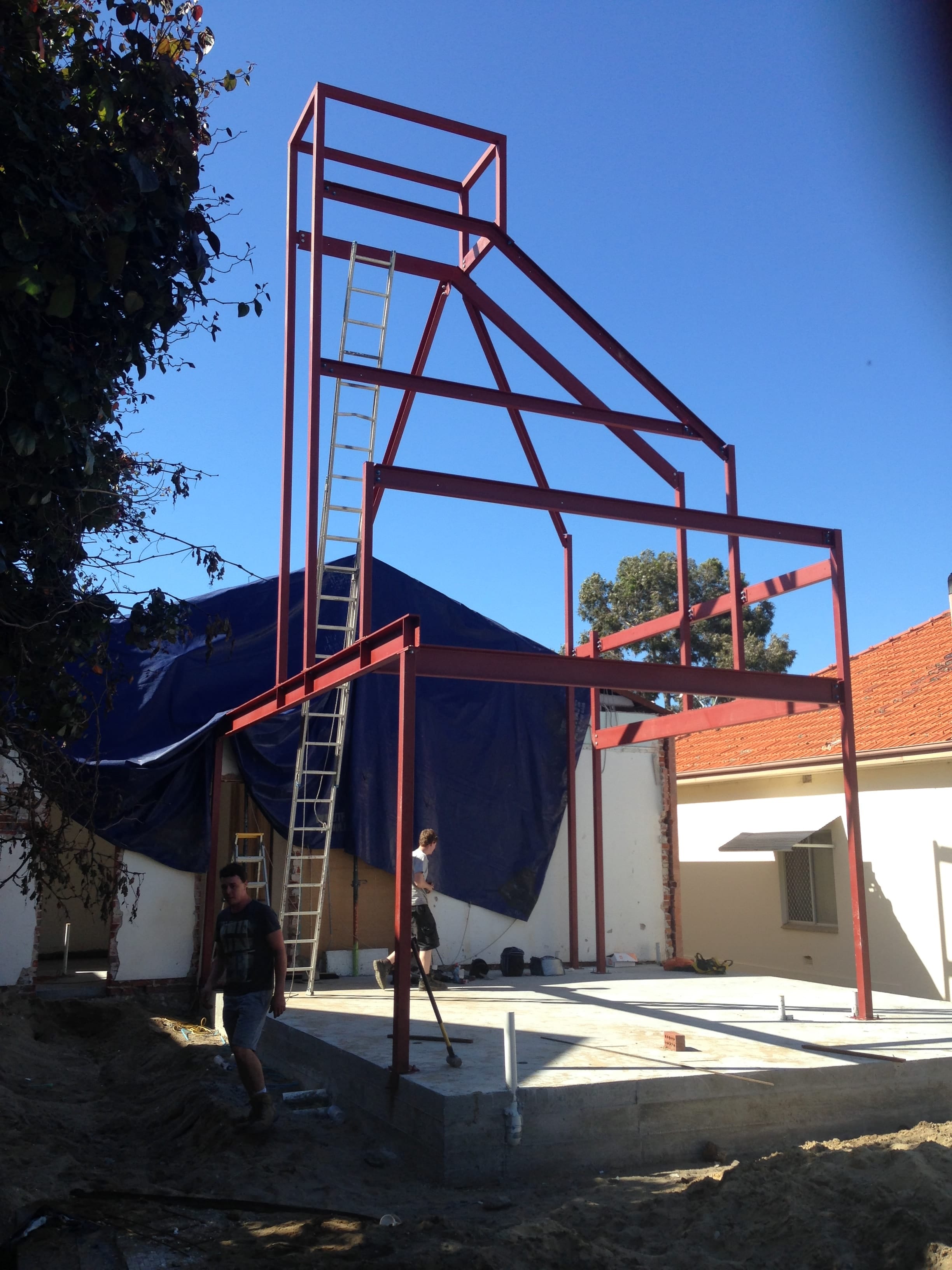
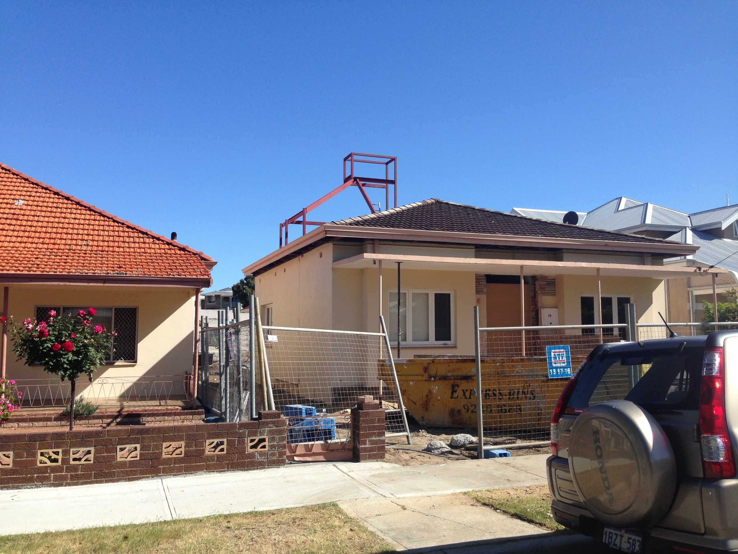
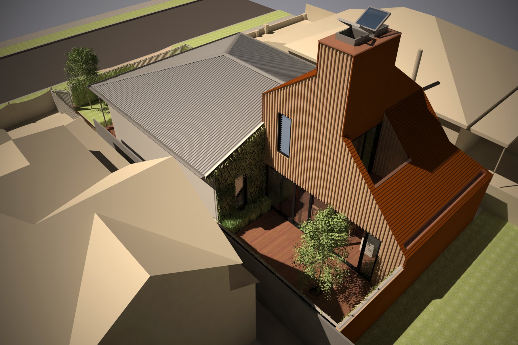
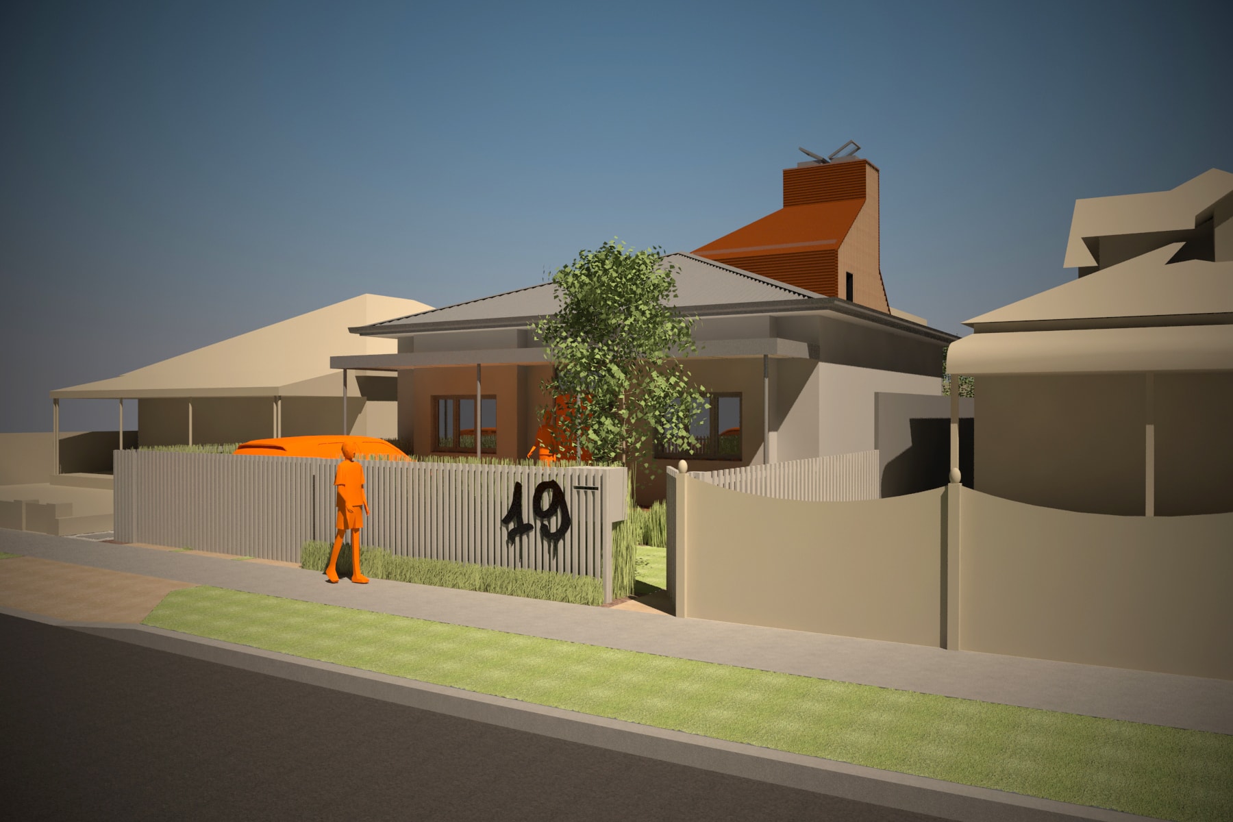
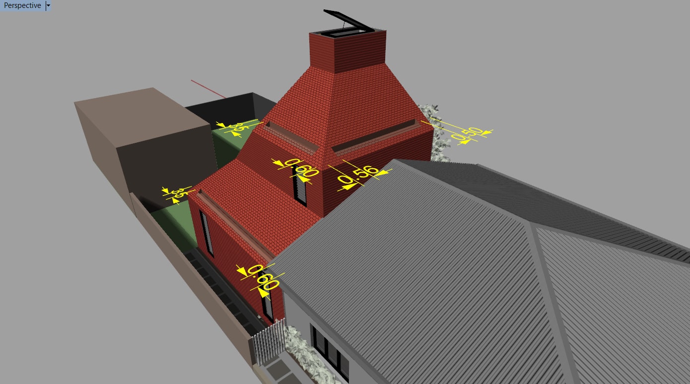
We searched for a relevant form for a two-storey extension to the rear of the block. Seen from the street, this form could suggest some tangible association to the backyard. The idea of chimney form, an ‘oast’ presented a familiar figure from the neighbourhood (Lincoln Street Ventilation Stack) and conveyed the aesthetics of a building ‘at work’. It is an industrial motif upgraded for the 21st century, rather than heating or drying, it is naturally ventilating the interiors.
“There is something satisfyingly industrial and other worldly about this… a little kooky perhaps but fun.”
Buildability
We created a defined split between old and new to find another aesthetic for the extension and to explore alternative construction methods for a quick build. The front half of the house is left mostly in its 1970’s ‘original’ state, its retention is a sustainable response while preserving the streetscape heritage albeit it fossilised in grey paint.
Small is the new big
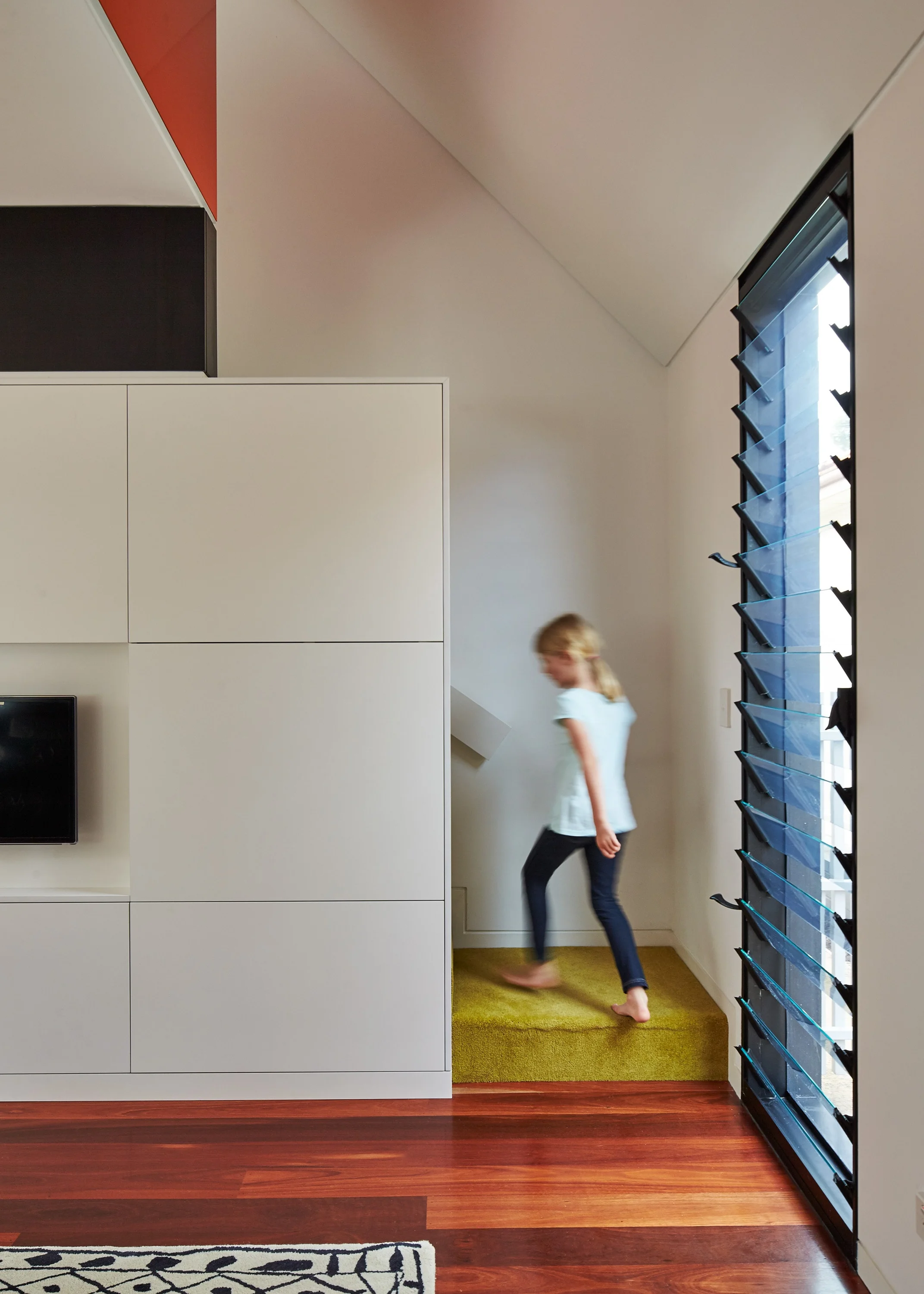
The new build is small, yet deceptively large. The main living areas expands into an adjacent, green walled courtyard to feel larger. The connection to the existing house included a ‘second’ hall, which accesses 3 new rooms (originally one) and allows the front half of the house to be closed off. Vertical scale, views and internal form compensate for smaller footprints. The kitchen’s coffered orange ceiling defines it as a room which also reflects the form of the first level spaces above.
Surface
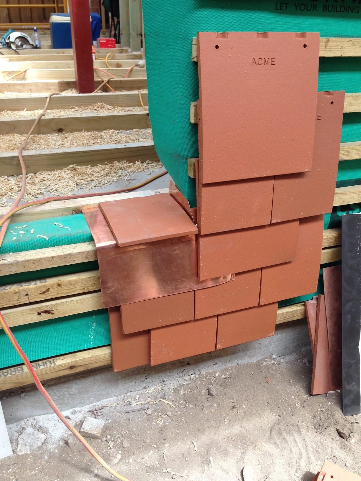
We needed a product that can be used for both façade and roof to create a unifying surface to the form. The clay shingles are often used on ‘oasts’, are a natural product with good sustainability credentials, and amazing textural and colour variance. The use of shingles is a specific craft and we worked closely with the roofing contractors to achieve the numerous standard junctions and some original details. The aim was to create a ‘loose’ feel to the design - the product provides mottled tones and movement across the façade, as not to look too precise or too precious.
“Gleefully abandoning the conventional; this small house thinks big and reminds us of industrial brick chimney stacks…Formal invention and innovative use of unconventional material abound and are handled with absolute finesse.”


